Bottom navigation
The user needs the ability to access different subtasks, views or modes.
Problem
The user needs the ability to access different subtasks, views or modes.
Solution
Use this whenever you need to enable switching between views or different modes in an app.
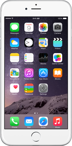
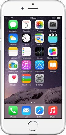
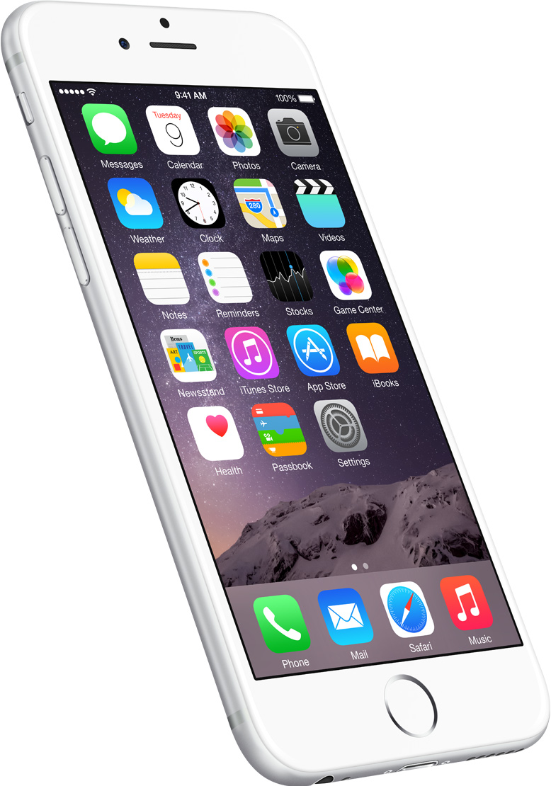
Provide short descriptions and meaningful icons for destinations.
Arrange the icons proportionally to the available space. Render from 3 to 5 items at once. If there are more than five items provide a "More" button which will load a list of additional options that are available.
Avoid crowding the navigation bar with too many items. Having too many actions or views will physically make it hard for people to tap on the one they want. In addition to that, with each new item the complexity of the app increases.
Use scrollable bars with caution. Items that don't fit in the initial view of the navigation bar are not visible to the user. One of the main reasons to use a bottom bar for navigation versus other methods like a hamburger menu or drawer is that the options are instantly visible. If you end up using a scrollable bar make sure to signal that there is more to see. The interaction model should be clear to the user.
Make the currently selected item stand out by highlighting it.
Sometimes it is required to display additional data next to the actions, like the count of the items contained under a view. Use a badge and avoid overloading it with unnecessary text.

